The Roaring 1920s

Step into the roaring ’20s with a palette that screams luxury and opulence. Imagine your living room adorned with gold and silver accents, walls painted in deep jewel tones and perhaps a bold black trim to tie it all together. The 1920s were all about making a statement, so why not incorporate Art Deco patterns and accessories to complement the color scheme? It’s like hosting Gatsby at your home, minus the drama.
The Fabulous 1950s
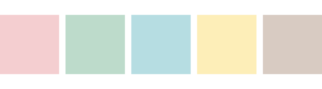
Now, let’s dial down the extravagance and step into the cozy, optimistic world of the 1950s. Picture your kitchen in pastel blue, your dining room in soft pink and your bedroom in mint green—colors that make every day feel like a sunny spring morning. The 1950s were about simplicity and functionality, but always with a touch of cheerfulness. Incorporating these pastel hues can turn your home into a mid-century modern haven that’s both stylish and inviting.
The Groovy 1970s
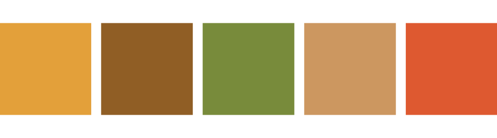
Feeling a bit more bohemian? Let’s groove our way into the 1970s with a color palette that connects us to nature and the era’s laid-back vibes. Think earth tones like oranges, greens and browns that can transform your space into a cozy retreat. Mix textures and patterns to embrace the eclectic style of the ’70s. It’s all about creating a space where you can kick off your shoes, throw on a vinyl record and just chill.
The Electric 1980s

Ready to pump up the volume? The 1980s were bold, dramatic and all about making a statement. Introduce neon colors, electric blue, hot pink and bright yellow into your decor to capture the decade’s vibrant energy. But remember, moderation is key; use these dynamic colors for accent pieces or feature walls to add a punch of energy without overwhelming your senses. It’s like having a perpetual party at home, where every day is a celebration of color.
The Zen 2000s

As the millennium dawned and the Y2K craze became a thing of the past, a sense of relief and new beginnings swept through the design world, ushering in the era of Minimalism. This movement, with its emphasis on simplicity and functionality, brought with it a palette designed to evoke calm and serenity in every corner of the home. Envision spaces washed in relaxing colors such as light brown, tan, shades of white and a tranquil mix of blues, including blue-grey and blue-greens. These hues, inspired by the natural world, promote a sense of peace and relaxation, turning homes into sanctuaries of calm.
Who knew a journey through time could be so colorful? By exploring these decade-inspired color palettes, you’re not just decorating your home; you’re infusing it with history, stories and a dash of nostalgia. Remember, there’s no one-size-fits-all for interior design. Mix, match and tweak these palettes to suit your personal style and the unique character of your home. Above all, have fun with it! After all, if the colors of your home don’t make you happy when you walk through the door, it’s time to get some samples and figure out what will!